Look alive, Saint Paul! All of Minnesota will once again be descending upon thee for high school hockey! As a born-and-raised St. Pauli Boy, I’m so glad that this tradition firmly remains in my hometown. I’ll be at Grand Casino Arena tonight, March 3, 2026, for the pros, but my eyes will also be there March 4–7.
A few years ago, I was in Detroit to visit a buddy on a hockey trip to see the Red Wings play on their home ice. We turned that into an annual trip that has brought us to Columbus and Buffalo, which is pretty awesome, but the cherry on top is that I got a Michigander interested in the high school boys state hockey tournament in Minnesota that year.
Did it help that the sold-out Class AA title between Andover and Maple Grove was decided in double overtime with Andover prevailing, 6–5? Yes. Yes, it did.
Now, before the Tourney, I send him a breakdown of the games with history and light analysis. He seems to like it. I hope that you do, too!
Class A – Wednesday
No. 1 Hibbing/Chisholm vs. Dodge County, 11 am CT
Hibbing/Chisholm is in because Hermantown was defeated in the sectionals by a new entry in Class A that has typically played in Class AA: Cloquet-Esko-Carlton. But unlike Roseau, a beloved northern team that would probably do way better in Class A than Class AA, C-E-C decided that they were done with playing with less resources against bigger schools. Hibbing used to be a power back in the day and has Class AA wins in 1952 and 1973 combined with one Class A loss in 1994, but the nature of the beast forced them to merge with Chisholm, so this could be the dawn of a new era. Dodge County is fun simply because they are Southern Minnesota boys located just west of Rochester. They had a nice run in 2021 on their way to losing to Gentry Academy, 8–1. All the boys dyed their hair blonde that year, and I wouldn’t be shocked to see this class do the same. I actually saw them walking together near downtown Saint Paul that year and wished them luck. Of course, they got slaughtered by Gentry; more on them later.
No. 4 Mahtomedi vs. No. 5 St. Cloud Cathedral, 1 pm CT
Mahtomedi has become an every-year power akin to Edina. They are a tucked-away northern suburb of St. Paul, and they won titles in 2020 and 2023. St. Cloud Cathedral has been doing pretty great the last several years. They won the 2019 and 2024 Tourneys and lost last year in overtime against East Grand Forks, 2–1.
No. 2 Delano vs. No. 7 Mankato West, 6 pm CT
Delano has come in fourth a couple of times. They are on the outskirts of the western suburbs of the Twin Cities. There’s money out there, but it’s still a good story. Mankato West is super fun to me personally. Mankato East used to be pretty good, but I don’t really recall a West team from Mankato doing much in the Tourney before.
No. 3 Warroad vs. No. 6 Northern Lakes, 8 pm CT
Northern teams get lots of love from those of us in the Twin Cities who have to endure the greatness of rich suburban teams. But Warroad goes to the Tourney a lot, so there might be some additional love for Northern Lakes, another northern team. However, there are some side eyes given to “combo” teams. Northern Lakes consists of students from Pequot Lakes, Crosby, Aitkin & Pine River-Backus schools. As with C-E-C, it’s the reality of competing with the big boys. You have to merge. Two great programs from the past, Bloomington Kennedy and Bloomington Jefferson, recently merged into one team, and the two main cities of Minneapolis and Saint Paul have basically combined all high school kids under one citywide team just to hope to compete in Class A! Warroad has four Class A titles but hasn’t won since 2005. They lost in both 2022 and 2023. Northern Lakes has no pedigree.
Class 2A – Thursday
No. 1 Minnetonka vs. Gentry Academy, 11 am CT
Gentry Academy is an interesting story. They won the Class A championship in 2021 and moved up to Class AA the following season because they knew that it wasn’t fair to be in Class A after breezing through that tournament. They are a charter school in Vadnais Heights with a HEAVY focus on hockey. If they continue on their successful path, I could see them becoming another Shattuck-St. Mary’s, a school in Faribault so renowned for hockey that they aren’t allowed to play in the Tourney. Maybe you have heard of Shattuck. Famous players that went there: Sid the Kid, Jonathan Toews, Nathan MacKinnon, Macklin Celebrini, to name a few. Also interesting is that Gentry downed the always deadly Hill-Murray squad to get to the dance. Minnetonka always comes to play and is favored to win it all. They won the Tourney in 2018 and 2023.
No. 4 Rosemount vs. No. 5 Grand Rapids, 1 pm CT
I have this one checked, because Rosemount somehow came out of the Section 3AA tournament as the victor over the likes of Cretin-Derham-Hall and St. Thomas Academy, two hockey-centric private schools. Rosemount is a public school that has had no Tourney success over the years. Grand Rapids is a northern team, so we always root for them in Minnesota. They have a great pedigree and last won the AA title in 2017 (over the Moorhead Spuds). Prior to that, they were a heartbreak team over the last many decades, losing the big game in 2007, 2006 and 1990. But they were massive when I was a kid. They won in 1975, 1976 and 1980 and lost in 1972 and 1978. Should be a good one. New power vs. old power.
No. 2 Moorhead vs. No. 7 Lakeville South, 6 pm CT
One word: Spuds. They have a legitimate chance at repeating as champion, though the two Lakeville schools, Lakeville North and Lakeville South, have proven that they are not to be underestimated in the Tourney. Lakeville South took out Lakeville North in the sectionals, 6–1. What’s crazier to me is that Farmington was the top seed in that bracket, and South took them out, 3–1. Farmington has no tournament pedigree, but the fact that teams like the Lakevilles, Farmington, Rosemount, Andover and Chanhassen are having success in recent years only goes to show that the new money is in the deeper suburbs…unless you’re Edina.
No. 3 Edina vs. No. 6 Andover, 8 pm CT
You know the deal here. Everyone in Minnesota hates on Edina, the Cake Eaters, except for people who went there or live there and continue to abide by the city motto, Every Day I Need Attention. If you hail from Edina, relax. These are jokes, and you already know how the rest of us feel about you. Andover probably doesn’t have a shot this year, but they did have to get through Maple Grove in the sectionals (in overtime just like in 2022) to get into this year’s tournament, so they are battle tested.
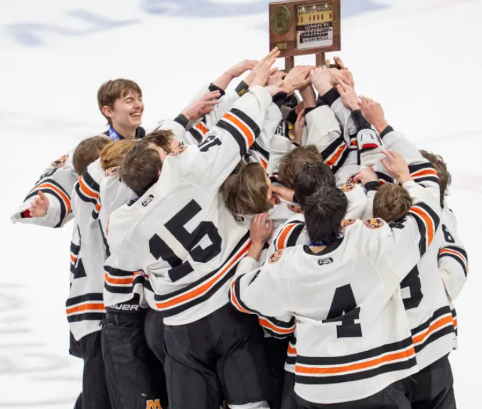
Photo Credit: Matt Blewett / Special to the St. Paul Pioneer Press