This is my solemn promise to myself to relaunch my creative side.
Reddit DataViz Battle: December 2018
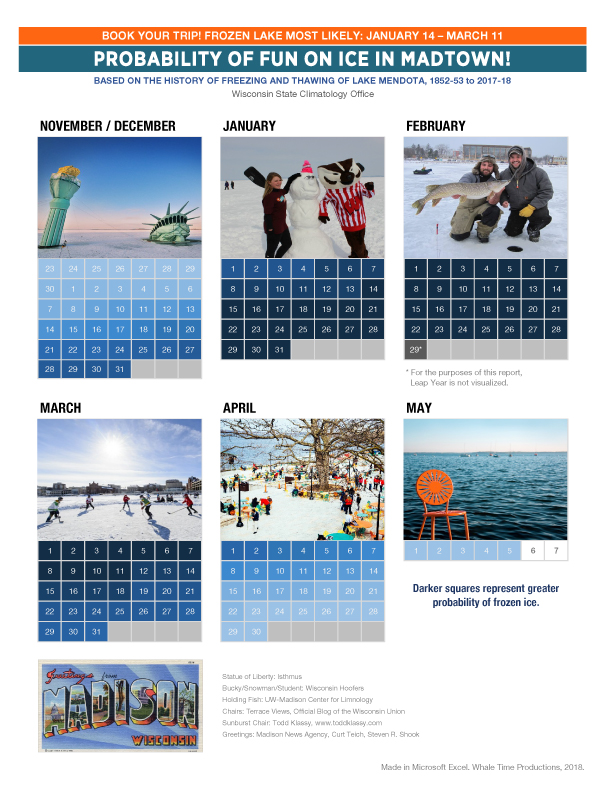
This post is a response to Reddit’s r/dataisbeautiful DataViz Battle for the Month of December 2018: Visualize the Freezing and Thawing Cycle of Lake Mendota.
I made a thing (this links to the PDF of the image below).
I’ve never submitted anything to r/dataisbeautiful before. I don’t know R or Python, and I’m a duffer in Tableau.
But I am dating a gal who’s learning these things, and she’s been enjoying some of the weekly and monthly battles she’s been finding online. I help with visual suggestions and takeaway statements. For this one, I made my own visualization.
If I’m not much of a programmer, what do I know?
Well, I’m a pretty good Excel designer. For this particular exercise, I used a shit-ton of Conditional Formatting rules to automate the shading. Maybe you’ll think it’s too much of an infographic, but I know how much data work went into this.
It’s old school, sure, and there are some Pivot Table actions that aren’t shown on my final Excel file that I probably should have shared. Here is the Excel file.
Many thanks to the folks who posted the photos I used for the calendar. You make the Internet better. I credit where credit is due.
Speaking of, here is the original data set.
This is my first effort, so be gentle. I’ll keep working at it.
